I was reading through the
No Caption Needed Blog (written by the authors of the book No Caption Needed, U of Chicago Press), and i stumbled across an interesting show going on at Duke University.
Flesh & Metal, Bodies & Buildings: Works from Jonathan Hyman's Archive of Vernacular Memorials can be viewed through the online galleries, with accompanying text.
The show is actually a lot more complex than it appears, though i don't think this was intentional. Hyman has an MFA in Painting from Duke U, with "photographic training." the vagueness of the attempted justification was the first eyebrow raiser. Why does it need justification as a photographic show? The statement gives an immediate air of self-realized photographic amateur-ness, and i'll admit that i'm always a bit weary of painters-turned-photographers, who seem to say "well yeah...but now all i have to do is push a button." However, one of my favorite photo series, Rays A Laugh, is by Richard Billingham, a painter-turned-photographer.
As you begin to flip through the show, you start to realize that the camera is not (primarily) being used as an artistic device, but rather almost purely as a documentation device. the "artistic" content lies in the dialog between the symbols in the photos, how theyre being used and what they represent. But that's exactly what got me thinking. That dialog IS the language of photography, however, i think that dialog is missing one more element: the photographer (or in other terms, the composition.)
If a photo inherently speaks of it's symbols, what theyre representing, and how they fit in a social context, then the way the photographer represents these elements is what separates the photos from the art of photography and the art of documentation. In the case of Hyman's show, the photographs begin to get repetitive, photos of tattoos on people's backs, photos of wall graffiti, patriotic graffiti, etc. The thing that troubled me is it became obvious that Hyman was trying to fight the repetition by shooting the walls or what-have-you from varying and, most importantly, arbitrary angles. Obviously, one way to avoid repetition is to vary the perspective, but when the perspective adds no more comment or meaning to the photograph than the same object shot at a different angle, thats when the power of documentation can be harmed by the attempt to seem artful. compare these three photos:


now look at this one:

the deadpan manner of this last photograph better showcases the element of the graffiti art, its message, and how it relates to its temporal context. It does this all without a distracting arbitrary attempt at artful composition, which makes the composition more interesting. I'm not saying that all documentary photography should be deadpan. If your primary focus is the art of photography, and you know how to make a interesting and loaded composition, please do!
Brian Ulrich is a contemporary master of documentary-style and deadpan photography, while still loading his compositions with thoughtful, subtle and powerful elements.
Of course, i'm not dissing the document in anyway. Post-modernism brought the deadpan archival elements of photography to the forefront. To strip away the photographer's voice, and use the photograph as a frozen moment in time, and see how it speaks purely as a social element is an interesting and powerful element of photography, if thats what the photograph is being used for. And i think thats what this show was attempting, overall, or should have been.
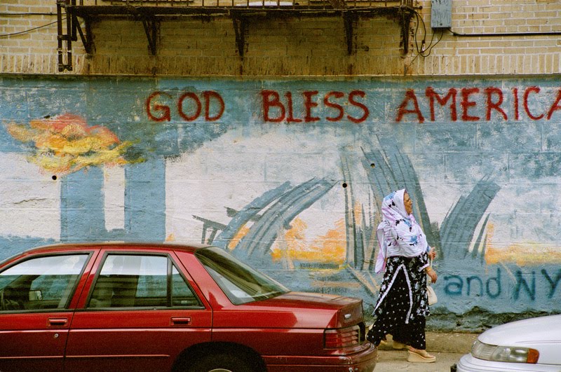
in the end, one of my favorite "art of photography" photos of the series was the last image

Formally: The red of the car mimics the red of the "God Bless America," while the arch of the woman's back mimics the stretching of the towers in the graffiti. Socially: the woman appears islamic, in front of a 9/11 memorial. I'll leave it to you as to who's eyes and opinions you'll view that statement, i'm just pointing out that it has a significant amount of social weight. What id like to point out here is that anyone who studies photography can easily pick apart the elements of this photo and how they relate well within the composition and perspective, in more than a "documentary" sense. What annoys me is that Hyman realizes this dialog and goes on to
describe it, flat out. I'm not sure if this is a "Hey look, i got a good one!" statement, or a statement to make clear the photographic language, because the audience wasnt
intended to be a photographic one. Weariness of painters-turned-photographers ensues.
overall i enjoyed the show, actually. the kitschy artwork and propaganda is amusing (though i dont believe it was documented to be so, which is more amusing, if not frustrating). However, if the photos are to serve as purely documentary, and the objects in the photos are the artwork, i think Hyman should have approached them in a much more deadpan manner. I'm all for the
archive fever, but attempting to arbitrarily artfully compose the photos took away from the message of the objects within and became distracting.